sitelen sitelen font
A new toki pona font

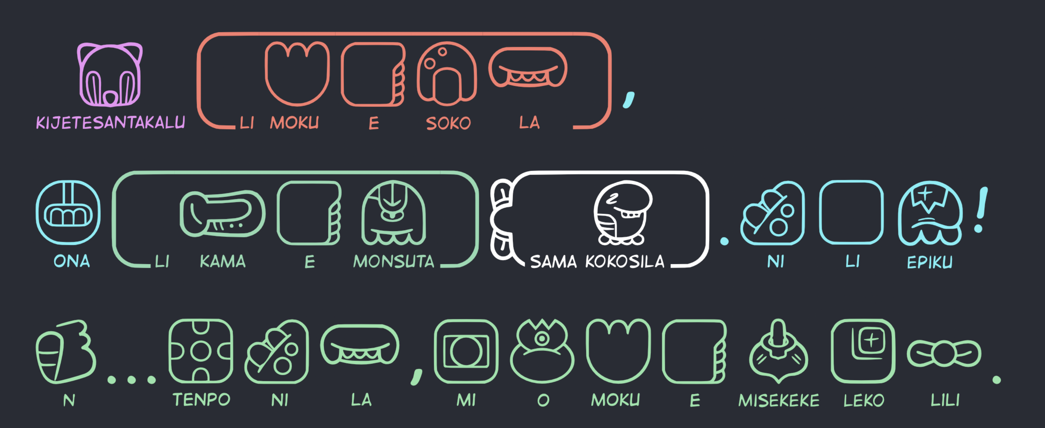
I borrowed the magnificient sitelen sitelen’s vectorisation made by jan Same to build a simple font.
Unfortunately, it is not possible to reproduce the ingenious non-linear system of the script in a conventional font (as far as I know). But it still looks good as a linear writing system. To use it phonetically (nimisin), you just have to type in capital letters.

I added the latin transcription under the ideogram to make it easier to understand and help learning it.
Containers
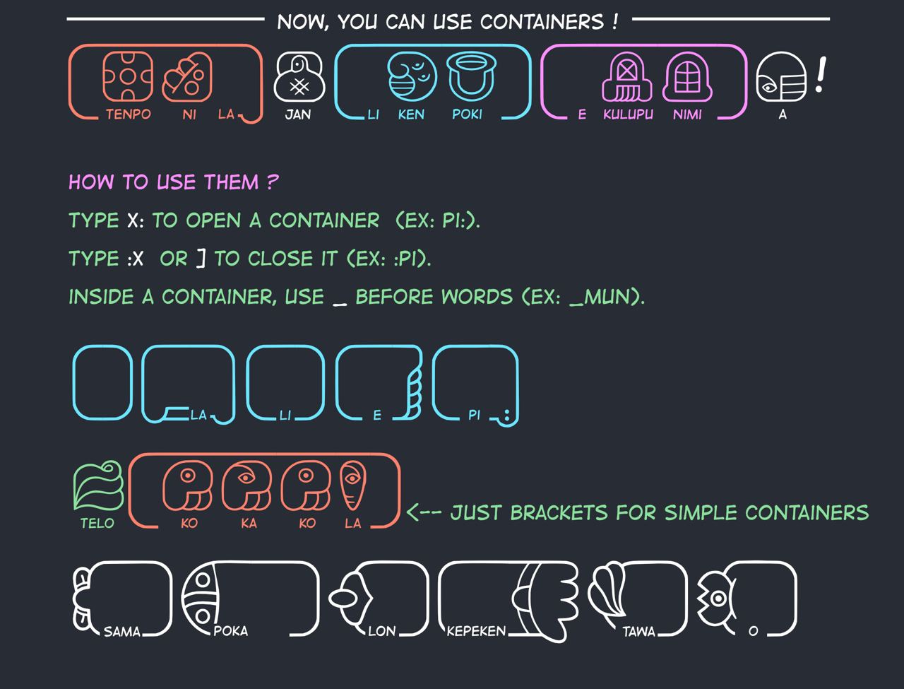
There are a number of containers you can use. They make reading easier because they segment the sentence into units. If you need a ‘space’ inside a container, use “_” instead.

last update 1.3.6
Thanks to the help of jan Maje and jan Talu
- _lon is corrected
- small spaces between words inside a container are corrected
- to add a space inside a container, use _ (underscore)
- recenter quite a few latin chars
- _poka is fixed
- _tawa is fixed
- capital letters in containers are fixed
- left bracket followed by underscore is fixed
- underscore + e is corrected
Credits
- Original design : Joathan Gabel
- Vectorized glyphs : jan Same
- Vectorized nimi sin glyphs : (leko, kokosila, misekeke, lanpan, epiku, tonsi, monsuto, soko, kejetesantakalu, n, jasima) jan Pitaki
- Font : jan Talu & jan Pitaki (http://tokipona.today)
All this with the precious help of the whole community of tokiponists and more particularly : jan Maje (May) and janKe Tami
Link
I hope you’ll have fun with it.
Ressources
https://www.jonathangabel.com/2015/jan-same-vectorized-sitelen/
http://livingtokipona.smoishele.com/examples/liveinput/liveinput.html
Licence
This work is licensed under a
Creative Commons Attribution 4.0 International License.

