sitelen tomo
My first motivation to learn toki pona came when I fell in love with Joathan Gabel‘s sitelen sitelen. I confess that I never really got interested in sitelen pona (although in the meantime I learned how to use it so I wouldn’t miss out on interesting things).
Graphically, the sitelen pona is not to my taste but the sitelen sitelen is a bit difficult to remember and reproduce. So I started to create a new script that is both to my taste and easy to remember.
Here are the main lines
- it is a linear ideographic system
- it is easy to memorize
- it is intended to be used as a Font (writing by hand might be… n…)
- it is fun
The learning process
I aim at a 30 minutes smooth learning curve. Most of the glyphs are obvious. Others are symbolic (reading about their origin once is enough to never forget them). Finally, a handful of characters are random, those are the ones to memorize. These are also the ones that come up most often so, whether you like it or not, you will remember them !
The concept
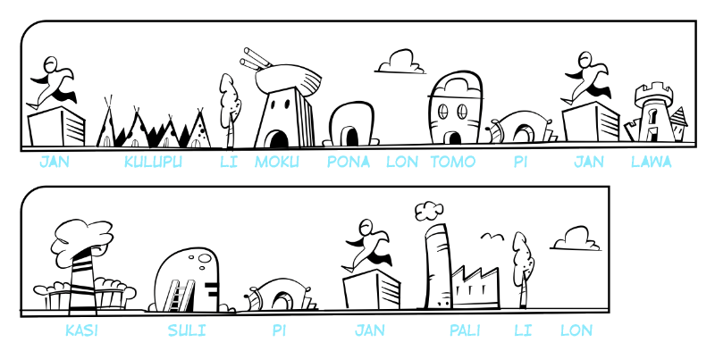
The idea is simple. Each sentence takes the form of a comic strip and produces a joyful urban landscape.
This is what it looks like:

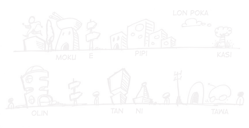
So, without the latin transcription, it goes…

Which reads :
The process
Well, it all starts with a paper and a felt pen. I draw a line and then let the pen run over it. When a page is finished, I select the elements I’m going to use for the font, scan them and redraw them in vector. This is the most time consuming part of the process as I try to reproduce the thickness of the strokes as well as the spontaneity of the drawing.

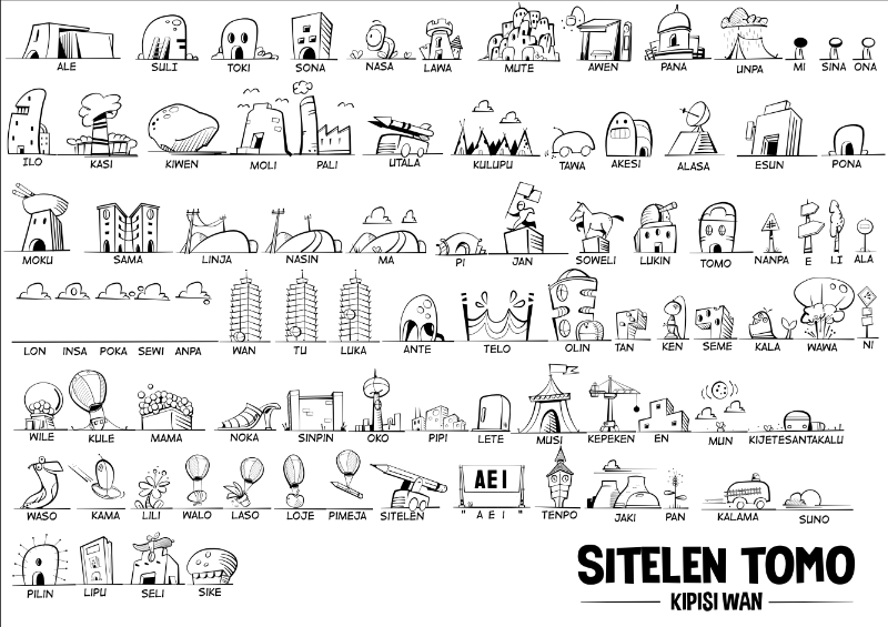
And this is what the first 80 words look like:

To do
Vectorize all 137 ideograms and make a font. It is a little bit tedious as, for some reasons I have to export all the glyphs as rasterized images and trace them back as vectors.
As soon as it is finished, I will come back to post the font and an explanatory table of all the characters.
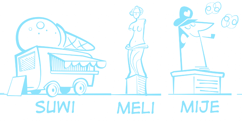
In the meantime, here are the last glyphs :
